ROSI 2.0 – Overview
I researched and designed transformative improvements to ROSI, the University of Toronto’s Repository of Student Information, bringing an outmoded system into line with contemporary best practices and envisioning it as a future-focused platform on which to build new administrative tools.
Explore a vision of what the ROSI community wants ROSI to be in the future.
—My mandate from the Director of Enterprise Applications and Solutions Integrations at U of T
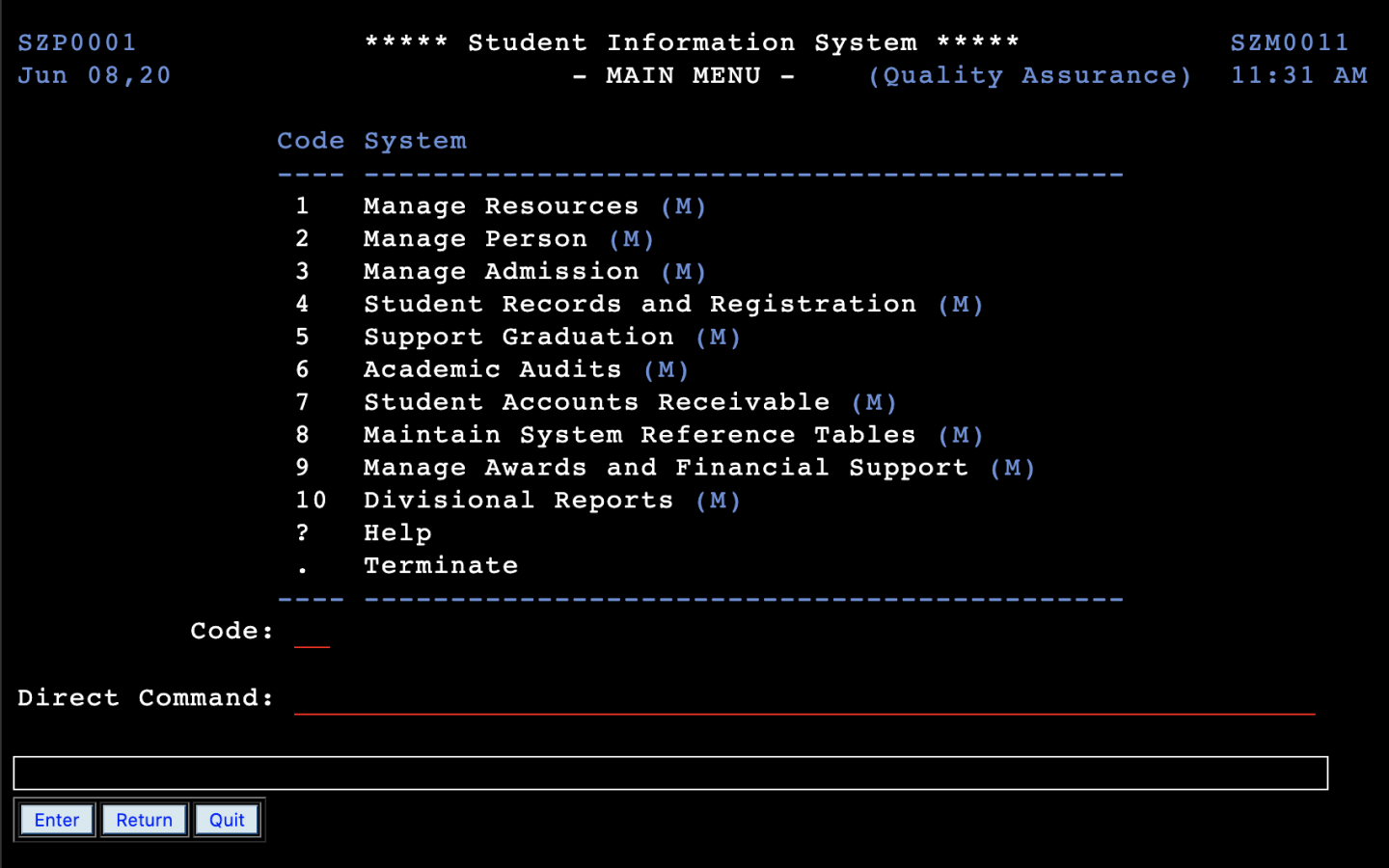
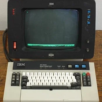
I found [ROSI 1.0] clunky and sometimes hard to navigate. This made getting information harder and slower than needed. It would effectively add time to a task that shouldn’t have taken long.
Also, remembering all the codes or keeping a cheat sheet was not conducive to getting information quickly.
—A research participant’s input on using ROSI 1.0
The challenge: ROSI is a decades-old system used by university administrators. Over time, administrative jobs have evolved (e.g. requiring immediate, customized reporting on live student information and activity). However, as a key administrative tool ROSI has not kept pace with these changes. Users became held back and frustrated by ROSI’s limitations and outmoded design.
I was mandated to investigate and bring to life a new vision of the system. I set a further goal to identify the highest value feasible UX enhancements that balanced user and technical considerations.
Outcomes: I conducted mixed methods of research, identified workflow-specific improvements and overall usability enhancements, designed novel features afforded by new technical capabilities, then demonstrated a feasible vision for ROSI 2.0 and a path towards additional integrations and functionality, where ROSI would become an adaptable platform that academic could extend per their respective needs.
Prototype testing with users showed that they could complete major job tasks as fast and faster versus the 1.0 system. Users passed navigation tasks that were failed in the 1.0 system. System usability scale scores were higher in the new system versus its predecessor.
ROSI 2.0 – My Process
I allocated a 50/50 split of initial system research and technical analysis, followed by iterations of design and testing of feasible enhancements for ROSI 2.0.
My research plan was to map the structure and functionality of the current system, learn from users what jobs they needed to get done, understand the pain points experienced by different people, solicit diverse views on the potential future of ROSI, as well as target and prioritize feasible UX opportunities.
My design plan was to iteratively build up the fidelity and complexity of my work based on my research findings of ROSI’s core uses and upcoming capabilities. I did this while continually vetting the feasibility of my ideas with technical and business experts, then through testing with expert and novice ROSI users.

Initial Structural & Usage Analysis
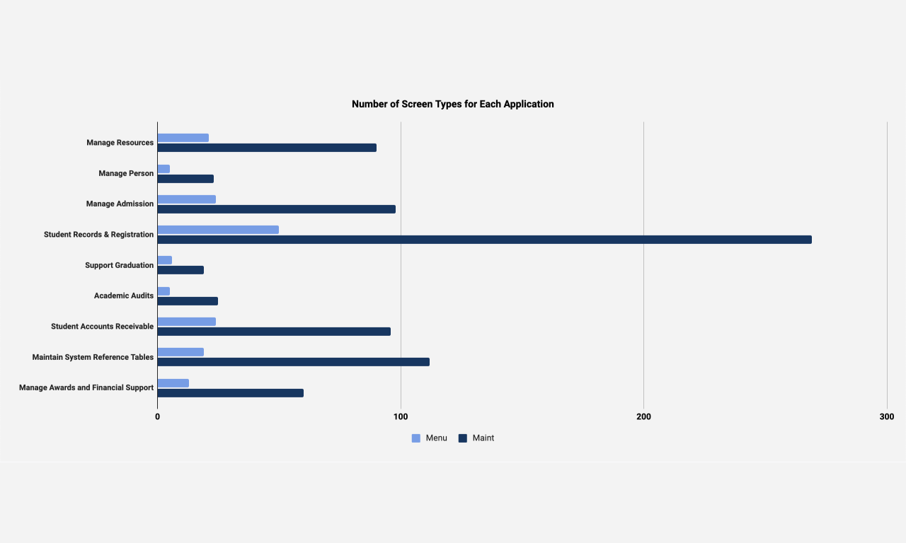
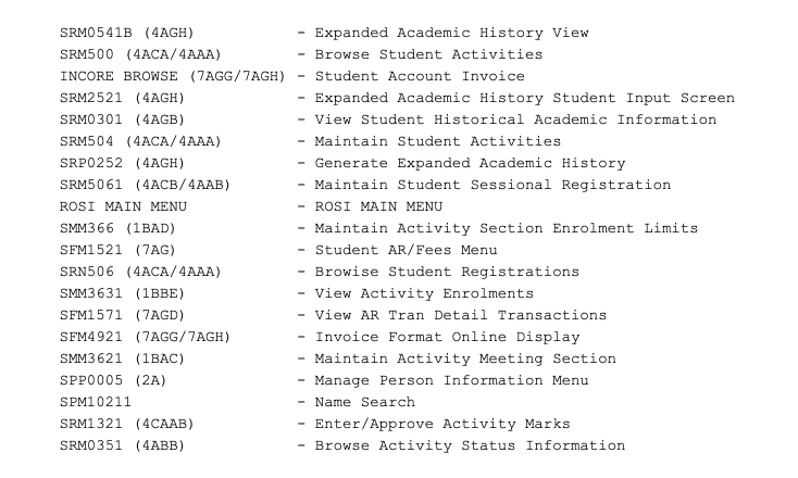
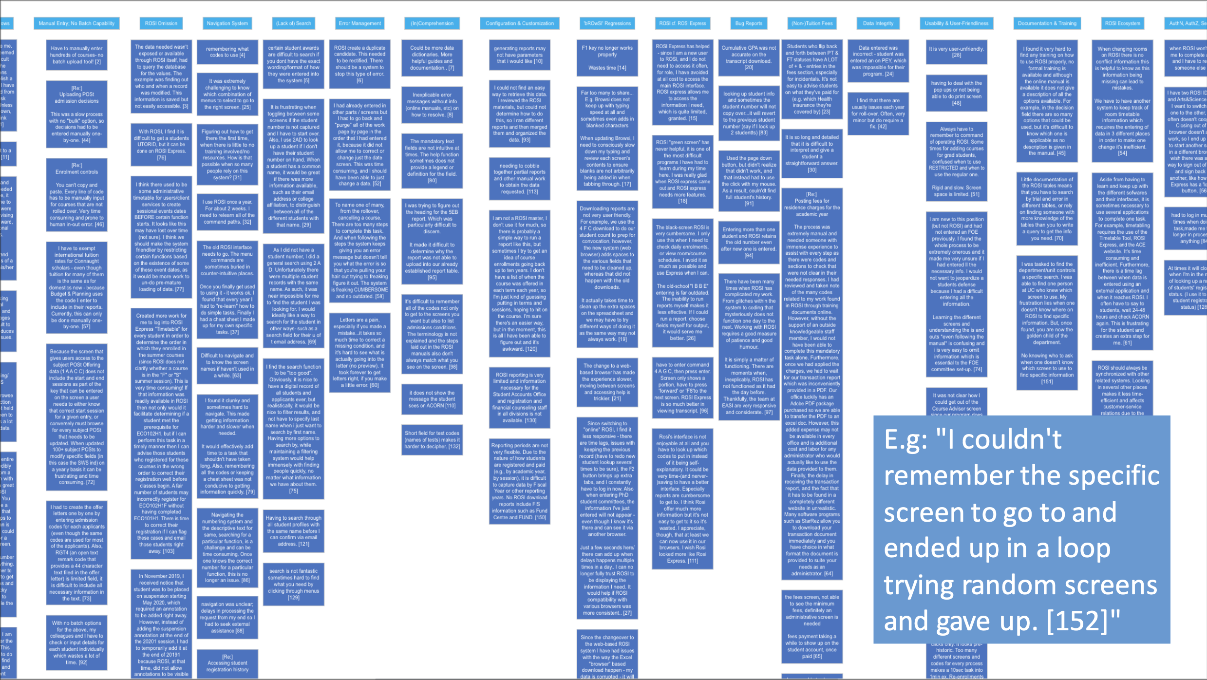
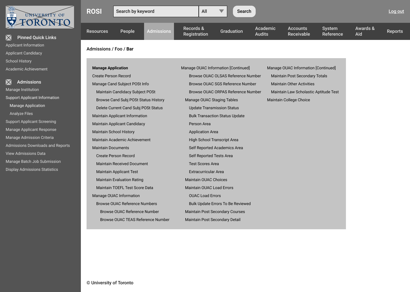
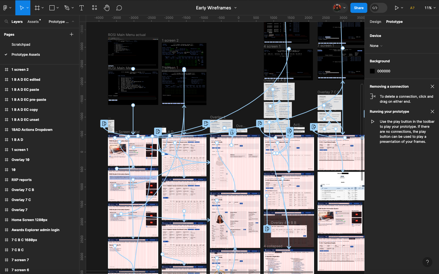
To begin understanding the scope and scale of ROSI, I investigated its “menu” and “maintenance” screens. This revealed almost 1000 individual screens that users might need to navigate and learn to operate! To learn which of these were used the most over an academic year cycle and in lieu of other existing analytics tools for the system, I reached out to a technical colleague who worked on ROSI to query a list of the most popular screens in ROSI.
I also requested access to a ROSI QA instance to begin directly familiarizing myself with the system so I could better contextualize what I would learn during my research.

Technical Inquiries
An important aspect of the ROSI 2.0 project was that the system was undergoing a major infrastructure upgrade. To learn about what this might afford elsewhere in the technical stack, I met with technical architects and senior developers to inquire about potential opportunities. These meetings revealed that historically-preformatted screens of data could now be atomized into individual elements, allowing for more user-friendly presentations of content and UI elements. Navigation systems and the system’s overall content structure could be simplified. New interaction paradigms and novel functionality could be introduced to streamline task flows. Further, my questioning revealed that integrations of new data from within and beyond ROSI were now possible.
The implication of these findings was that my potential design space opened up extensively, but I still wanted to learn what prioritizing constraints I should impose on that work, so my research then turned to users.

Individual Interviews, Job Shadowing, & Community Survey
I conducted interviews with ROSI users and other experts. These invited commentary on the 1.0 system and how jobs and tools were evolving. I also observed administrators in action using the 1.0 system.
These activities revealed the fluency with which experienced users traversed and operated the system, and also how cumbersome and opaque it was to novice users. Almost all users felt under-equipped to meet contemporary job demands (e.g. producing custom reports and viewing live data from the system).
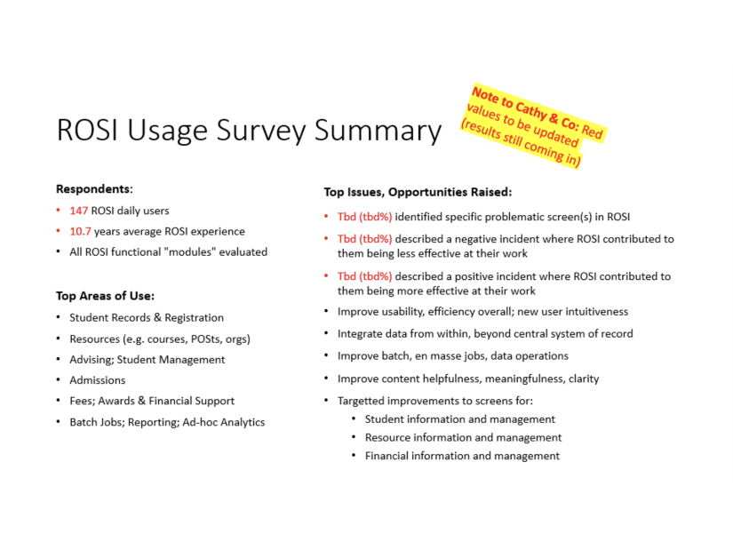
I then drafted a questionnaire that was released to the ROSI userbase, from which I gathered data on ROSI expertise, usage, and valenced experiences. This added clarity and precision to my understanding of where and how ROSI 1.0 was deficient and useful.
User Personas
Based on 25 interviews and 173 survey responses, I developed two personas whose respective journeys would inform many subsequent design decisions:
Experienced Expert: This persona represents a long-time administrator at U of T who has worked with ROSI in several administrative capacities and is highly proficient in using the system per its current capabilities. They fluently traverse it using keyboard commands and do not rely on help resources. They are often responsible for important tasks using ROSI in their respective business units. Undermining their productivity would harm the institution.
New Hire Novice: This persona represents a recent hire filling in for another employee on leave or supporting other administrators for a short-term basis during a busy time of the year. Thrown into the deep end, they are overwhelmed by ROSI’s opaque and obscure interface and maze-like navigation system. They don’t even know the name of what they should be getting help with and struggle to use ROSI. They take offense to being subjected to this archaic system.
Research Findings & Takeaways
After my interviews, shadowing, technical analysis and community survey, I came to these initial conclusions:
- ROSI 2.0 should be more intuitive and user-friendly (addressing usability issues throughout the system)
- People want on-demand reports and other views of live data (lead times are too long currently)
- People want to be able to use central integrations and microservices (there is too much silo’d data)
- Don’t get in the way of expert muscle memory (e.g. fluent screen code entry)!
Integrate ROSI-based services internally and externally: To better equip ROSI’s users with well-organized, descriptive, predictive, and possibly prescriptive features that they will find useful. Be cognizant that the future of ROSI is not an isolated student information system, but an important tool making up part of a broader ecosystem of multiple rich data sources. Look to provide a cohesive, integrated experience for users leveraging microservices and APIs. ROSI will be a platform for divisional development teams to extend per their respective needs. Collaborate with technical architecture staff and ROSI CAB re: these initiatives.
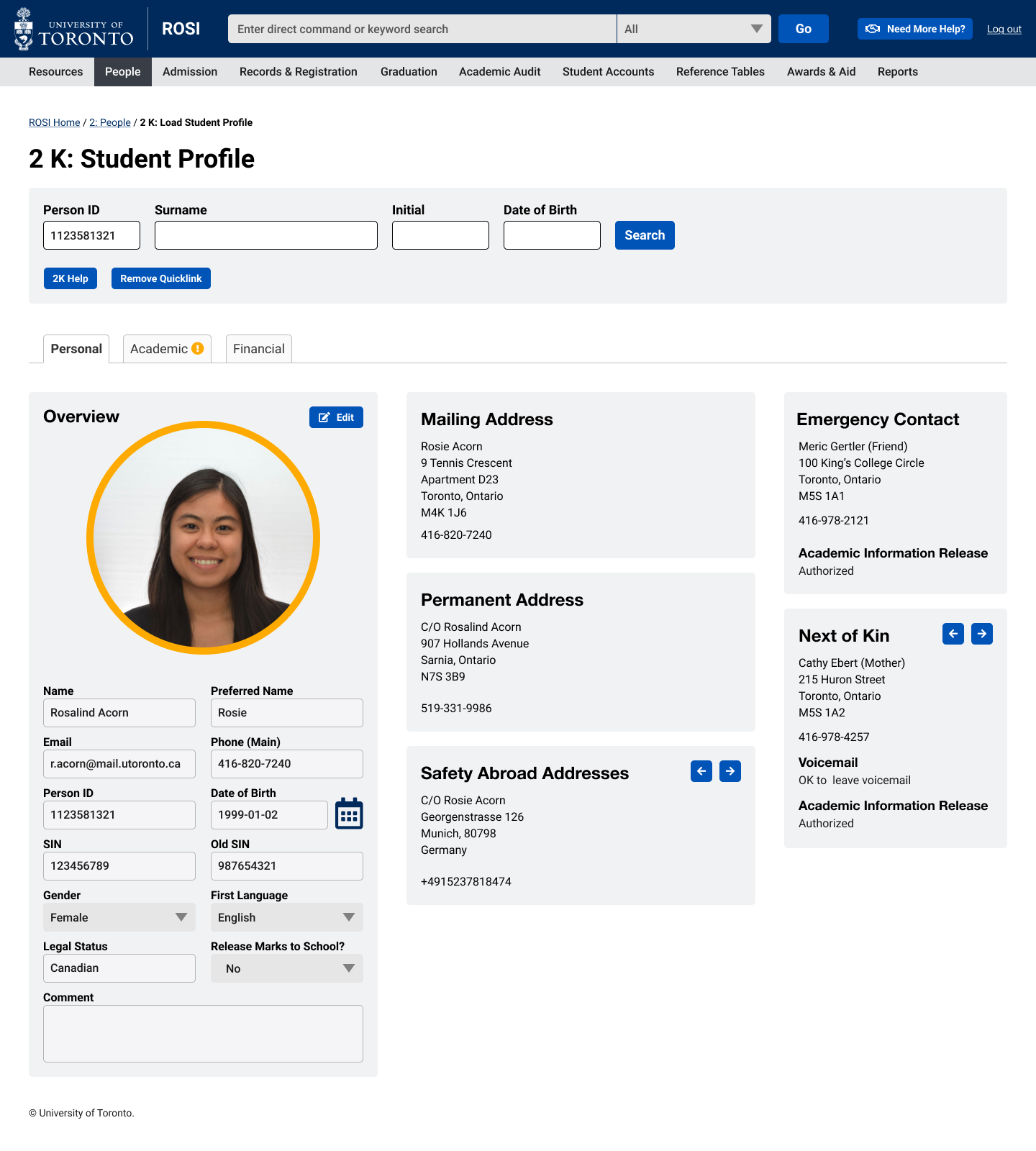
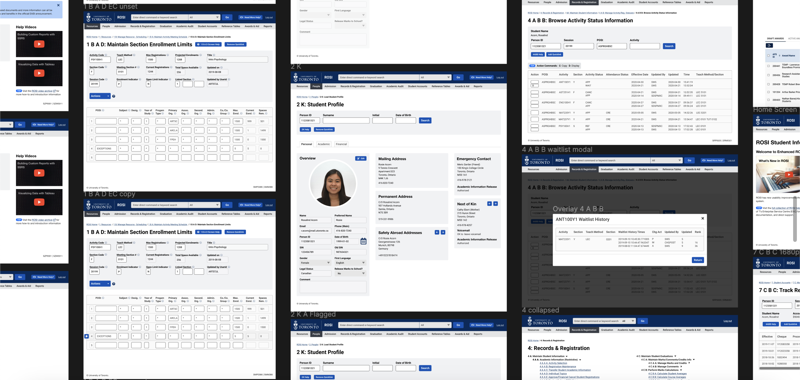
Note: Current ROSI can only display data from one database table on a given screen. This results in conceptually and procedurally related information that happens to be stored in separate tables not being presented to users in the optimal manner for many contexts. An enhanced ROSI can overcome this constraint, which opens up valuable design space. E.g. the student profile, which is a proposed new ROSI screen, has the potential to synthesize content from within ROSI and other systems (e.g. a student CRM) to give administrators a useful and efficient screen (with, e.g. a proactive warning) to that supports advising students.
—An internal explanation of one of my design tenets
Design Objectives & Design Tenets
My research motivated what my design objectives would be, roughly:
- A usability-enhancing overhaul of UI, IxD and navigation mechanisms
- Representations of improved user flows for frequent jobs-to-be-done
- Representations of desirable and feasible potential new data integrations and enhanced system capabilities
I also developed high-level design tenets as UX touchstones:
- Simplify ROSI’s user experience
- Respect the fixed constraints of ROSI’s architecture, implementation
- Respect the good aspects of ROSI 1.0
- Integrate ROSI-based services internally and externally
- Make ROSI more user-friendly
I knew my work would be handed off to and continued by other UX practitioners, so I regularly demoed my work to them and annotated my project artefacts. For example, the design tenets I drafted helped guide others to understand my “what”, “why”, and “how” rationales regarding my strategy and how it could be executed.
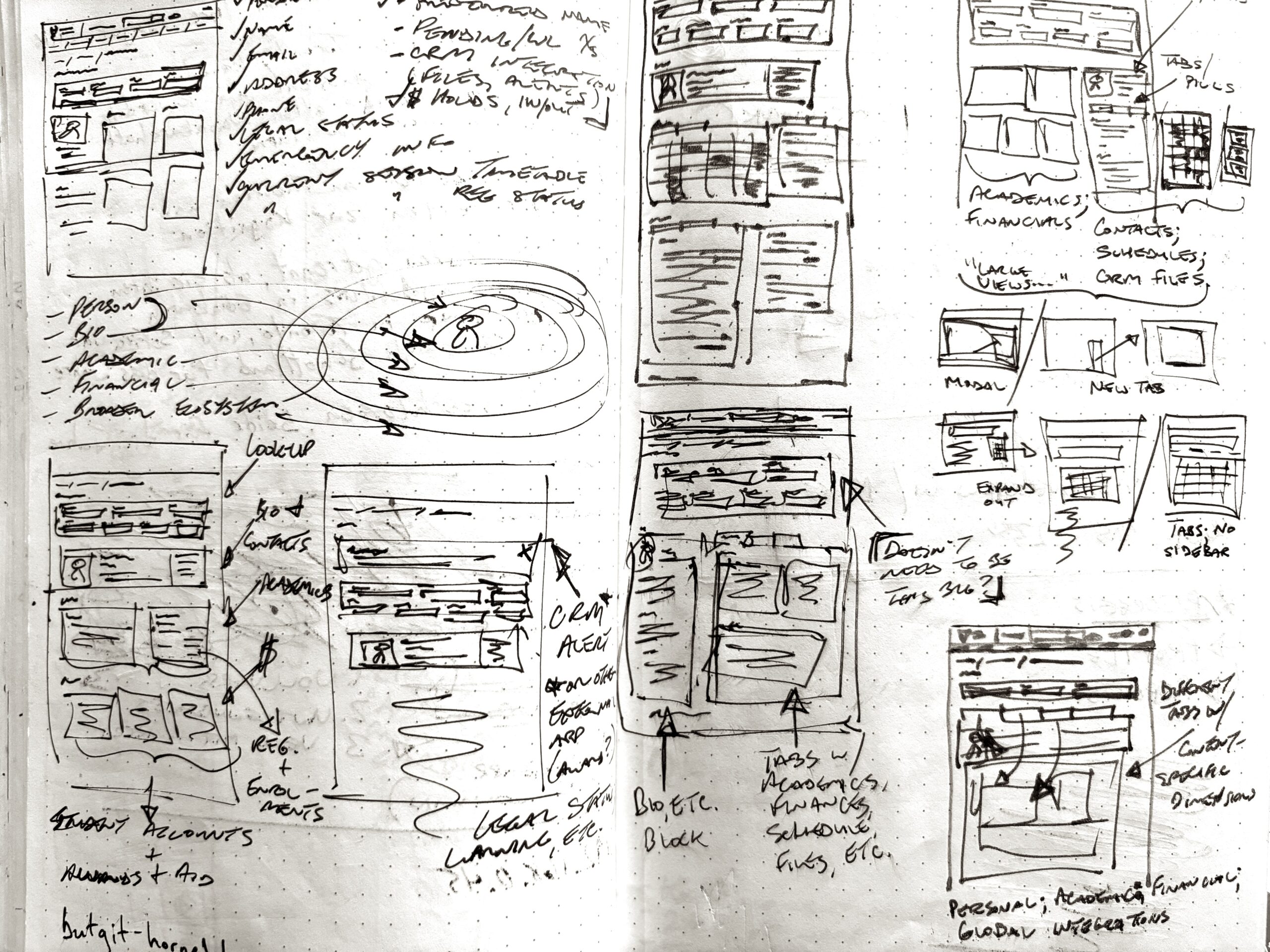

Iterative Low-Fidelity Sketches, Wireframes, & Static Mockups
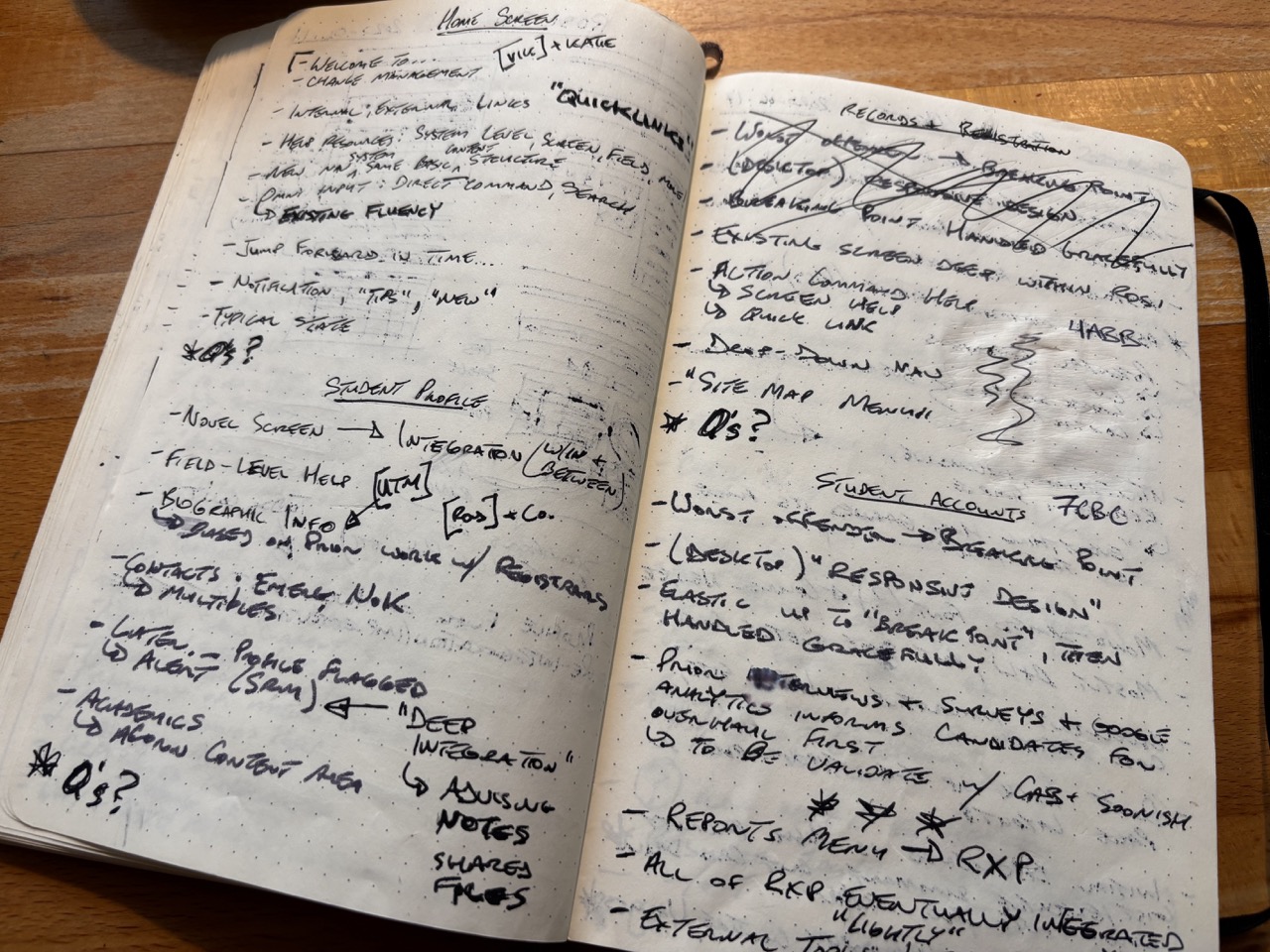
My design process began in earnest as rudimentary notebook sketches of initial ideas and variations on how those might appear and function. These iteratively evolved into digital wireframes and higher-fidelity mockups using Figma. I considered content, layouts, interactions and navigation systems of the application.
Before building prototypes or testing with users, I vetted the feasibility of my ideas and their anticipated difficulty to implement with my technical and business process colleagues, adjusting where needed.
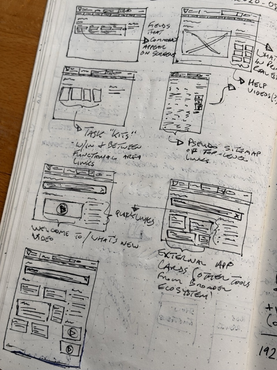
- Here I was brainstorming what content and functionality might earn its place on ROSI’s home screen. I considered first-time experiences (where onboarding users to the new system might still be necessary, even after preceding change management efforts), as well as how the home screen could be a dynamic landing screen for returning administrators (who could customize it to streamline their respective workflows through quicklinks to their primary task screens and connected apps).
Using sketches and Figma, I considered content, layout, interactions, and integrations via the perspectives of usability and productivity, while being sensitive to feasibility and high ROI opportunities.
2. This shows my work-in-progress to determine the optimal layout of student profile data, balancing readability, efficient use of space, and relevantly-integrated information from throughout ROSI for use by staff during student advising sessions.

3. This video is a quick explanation of a few of the UI and IxD features I added to ROSI 2.0 that appear on the Student Profile screen.
Functional Prototypes & Usability Testing
Using Figma (for rapid production and iteration of prototypes) and AxureRP (for keyboard inputs and emulated system responses), I created a representation of my initial proposal for feasible improvements to ROSI and began testing with different types of users.
I conducted six remote usability tests based on core business process scenarios I had identified earlier in my research. These were straightforward “happy path” use cases of previously identified jobs-to-be-done (e.g. “Main job: advise a student when we meet”, “Micro-job: Update a student’s emergency contact info”) to validate the main principles of the usability enhancements I proposed, as well as test search, help, and customization functionality.
User Testing Findings
With minimal acclimating (e.g. “You can enter any menu commands you already know into major input areas”), users were able to immediately reach and complete their current common job tasks, as well as clarify confusing aspects of the 1.0 system and customize the 2.0 system per their needs. I observed as-fast and faster task completion times (even with long-term experts of the current system).
However, my results indicated that due to many task- and field-level help content being sparse or absent in the 1.0 system, additional staff resources would need to be committed to writing those for the 2.0 system.
I also received positive feedback on the new affordances introduced in my proposal, such as the navigation systems, overall look and feel, and my initial hints of an integrated student profile.
It was known and out of scope for my work that the APIs to afford customized integrations with ROSI would need to be designed and engineered by a central ROSI technical team before being used by divisional development teams.
Presenting to Leadership & Advisors; Project Conclusion
After validating my ideas with subject matter experts and testing with users, I remotely demonstrated a representative scenario of my recommendations to institutional leadership and fielded their questions alongside my project team.
The work was well-received by senior institutional leadership and influential ROSI users who were impressed by the potential for more capable and efficient workflows.
A lot of this looks terrific. I think it is a natural evolution now that ROSI is off the mainframe.
—The University of Toronto’s Registrar
In support of this and thinking about the cost that currently exists with staff turnover, people taking leave and someone filling in and the learning curves that are involved is hampering operations. Just another strong vote in favour of something like this to help with that.
—An Associate Dean at the University of Toronto